The basic idea of the Neutrals method of color balancing is that you simply point and click on objects in the image that you know should be neutral. If you stop and think about it, most images have built-in grayscales, hidden in the objects in the scene. Here are some examples of common neutral objects: paper, clothing, automobile tires, teeth, eyes (whites and pupils), clouds, white painted objects like houses or cars, black painted objects, asphalt, tree bark, snow and many others. Often, a single neutral object will have many tones, due to illumination variations. For example, the folds in a white shirt will show many different tones of the base white fabric.
The Neutrals method allows a continuous color balance correction across all tones. This means that it can easily handle "cross-overs," for example, an image whose dark colors have a green cast and whose light colors have a red cast. The tool panel shows a simplified, five-step summary of the type of color cast your image has.
Although this display shows only five regions (for the sake of clarity), the underlying color balance correction is continuous across all tones.
Color balancing using Neutrals is very easy. Simply select Neutrals from the pop-up menu at the top of the color balance tool panel, and then click on objects in the preview image that should be neutral. Every time you click on the picture, an entire region of adjacent, similarly colored pixels will be used collectively to determine the color cast. This region is shown momentarily as a brief "flash" of a blue overlay (if you have the "Show Sampled Region" preference enabled):
This means you don't need to select very many neutral objects, but you should make an effort to point at different tones, from black to white and some tones in between. If the master SmartColor Mode checkbox has been checked, some color balance correction will have been done for you already. The automatic correction influences the darkest and lightest colors in the image more than the midtones, so you may want to be sure to mark some neutral midtones if you can. (Note that the SmartColor Preferences settings control whether SmartColor will affect the color balance.)
You may also find that by zooming and scrolling, more precise neutral selection is possible, especially on small or thin objects.
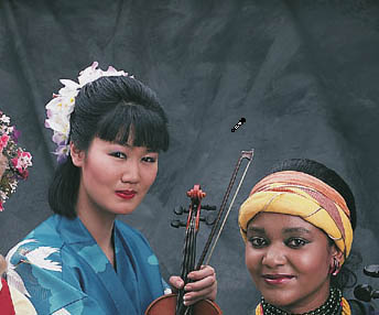
In our sample image, the background is assumed to be shades of gray. We will click in a few places, including lighter and darker samples. Two of the musicians have black hair, and the center musician's robe has white birds on it. Since these should also be made neutral, we'll click on these colors as well.
After every click of the mouse, the Color Balance panel and the preview image are updated to show the current color correction. If the master SmartColor Mode checkbox is checked, each click also recomputes the automatic settings for the edit tools that follow (black/white, brightness/contrast, hue selective).
We see here that for our example, we have a slight blue cast in the highlights which passes through cyan on its way to green in the shadow tones.
This displayed grayscale has inset squares to visually show the color cast that exists in the original image. Beneath each square is a general indicator of the color of the cast (R = red, G = green, B = blue, C = cyan, M = magenta, Y = yellow). The strength of the cast is also shown, expressed in saturation units. Zero means dead neutral; larger numbers indicate a more pronounced color cast. This is the color cast that is removed by the color balance tool. Note that these numbers are always with respect to a neutral with equal red, green and blue values. If you have used the Color Balance Preferences button to define a custom target neutral, it does not affect these values.
If you click something non-neutral by mistake, click the Undo button. To undo all of the color balance edits, click the color balance Reset button, which is found inside the lower right corner of the tool panel. After resetting the color balance tool, you can click the color balance SmartColor button to redo the automatic color balance correction.
You will probably find the Neutrals method of color balancing to be easier, faster and more accurate than the Sliders method. In fact, the Neutrals method can accurately color balance an image literally in seconds, once you get the hang of it.